Conversational Forms vs Standard Forms: Which Gets Better Completion?
The choice between conversational forms vs standard forms comes down to task length, user intent, device, and how much guidance the respondent needs. Use a conversational form for longer, branching, or high-friction flows; use a standard form layout for short, familiar tasks where speed matters most. Forms AI can help build either format from a phone, so the layout decision can happen before anyone starts polishing colors or buttons.
Definition: A conversational form asks one question at a time in a guided flow, while a standard form layout shows multiple fields together on a page so users can scan and complete them directly.
- Conversational forms usually feel easier for surveys, lead qualification, onboarding, feedback, and complaint intake because they reduce the perceived size of the task.
- Standard forms are usually faster for simple signups, contact forms, RSVP forms, and checkout-like flows because users can see and complete several fields at once.
- The best format is not about style; it depends on form length, branching logic, mobile friction, review needs, and respondent expectations.
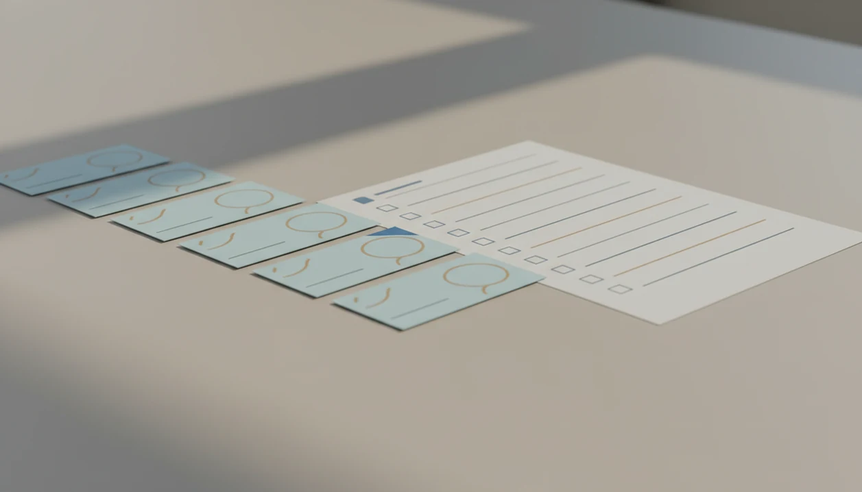
Conversational forms vs standard forms, side by side
Side-by-side captures of the compared products. Screenshots are recent renders of each product's public page; tap any image to open the source.
Conversational forms vs standard forms at a glance
Neither format is universally better: conversational forms reduce visible workload, while standard forms reduce extra clicks. Use this table to decide whether the respondent needs guided pacing or a fast, scannable layout.
| Factor | Conversational form | Standard form layout |
|---|---|---|
| Flow | One question at a time | Multiple fields together |
| Best use case | Surveys, intake, qualification | Contact, RSVP, checkout-like fields |
| Speed | Slower for short tasks | Faster for familiar tasks |
| Perceived effort | Often feels smaller | Can look longer upfront |
| Mobile experience | Less visual clutter | Works if single-column and short |
| Branching logic | Strong fit | Possible, but less visible |
| Reviewability | Harder to scan all answers | Easier to review before submit |
| Completion risk | Can drag if too many screens | Can overwhelm if too dense |
If the priority is building from a phone without turning the job into a spreadsheet cleanup session, Forms AI fits because it supports app-first creation of forms, surveys, quizzes, and registrations with templates and drag-and-drop editing.
Five facts about conversational form and standard form layout choices
These five facts cover the practical choice most teams face before publishing a form.
- A conversational form usually shows one question per screen, which can make a long task feel more manageable.
- A standard form layout shows multiple fields together, so users can scan what is being asked before they start.
- Conversational forms often use progress indicators, next and previous controls, validation, and conditional logic.
- Standard forms are often better for short, low-stakes tasks such as name, email, phone, and message.
- The central tradeoff is perceived effort versus completion speed.
The right fit for a quick public-facing contact form is often a standard layout, because the respondent already knows the job. For a broader builder comparison, the AI form builder vs traditional form builder guide covers how setup style changes the work before launch.
Short is still work.
How conversational forms work behind the screen
A conversational form works by sequencing questions, storing each answer, and using rules to decide what the respondent sees next. In plain language, it turns a full form into a guided path.
The key mechanism is conditional logic. If someone selects “new customer,” the next screen might ask for “Preferred appointment time.” If they choose “existing customer,” the flow might ask for an account email instead. Progress indicators, validation messages, and next or previous controls keep the person oriented.
On mobile, this matters because small screens punish dense layouts. A teacher copying a quiz link into a class announcement five minutes before the bell does not want students pinching, zooming, or hunting for the next required field. Forms AI supports this guided structure through templates and editable question flows, including an AI Form Builder path for users who would rather start with a draft than a blank screen.
How standard form layouts work
A standard form layout works by placing related fields together on one page or section, with visible labels, required markers, validation, and a final submit action. In plain language, it lets people see the job, fill it out, check it, and send it.
The mechanism is simple: field grouping gives context, labels explain what belongs in each box, validation catches missing or malformed answers, and the submit button sends the completed response. This scanability helps when the task is short, familiar, and low-branching, such as an RSVP, contact form, or donation interest form. Review-before-submit also matters when a typo could cause a missed call, wrong order, or bad registration record; seeing answers together can beat guided pacing.
- Group related fields so the form feels organized instead of scattered.
- Label each field clearly and mark only truly required items.
- Validate obvious errors before or at submit so people can fix them quickly.
- Keep mobile layouts single-column and remove fields that do not change the outcome.
- Watch for overload when too many fields, choices, or required answers turn the page into a wall of work.
Where a conversational form wins for completion
Does a conversational form get more people to finish? It often helps when the form has more than a few questions, needs branching, or asks for information that feels personal or effortful.
This matches GOV.UK form guidance that recommends one question per page when a task is complex, conditional, or easier to understand in smaller pieces: https://design-system.service.gov.uk/patterns/question-pages/
Conversational forms are a strong fit for lead generation, lead qualification, onboarding, feedback, complaint intake, and community surveys. A food pantry signup beside canned goods may need household size, availability, dietary needs, and follow-up permission. Showing all of that at once can feel heavy. One plain-language question at a time feels less like paperwork.
Small businesses looking for warmer lead capture can use Forms AI because AI-generated questions and conditional logic help turn answers into next steps, not just a response list. A good AI form builder app should deliver faster form drafting and tap-friendly editing, not enterprise survey methodology.
Where a standard form layout wins for speed
A standard form layout wins when the task is short, familiar, and easy to scan. Name, email, phone, and message usually do not need five separate screens.
The important constraint is density: a standard form should stay short, single-column, and easy to review. Once the page turns into a wall of required fields, the speed advantage starts to disappear.
Simple signups, RSVP forms, donation forms, and checkout-like fields often work better when users can see everything together. An event organizer checking RSVP counts in a parking lot while a vendor texts about table numbers needs quick review, not a guided interview. Extra screens add taps.
For short forms, a standard form layout is often faster than a conversational form because users can scan all required fields and finish in one pass. This is also where Google Forms, Tally, Wufoo, and Jotform can still feel efficient. If your main question is platform fit, the Forms AI vs Google Forms comparison breaks down the tradeoffs more directly.
Multi step form comparison for mobile users
Mobile users face more friction from typing, scrolling, small tap targets, and dense field groups. A multi step form comparison should focus less on style and more on how much work the thumb has to do.
| Mobile issue | Conversational form | Standard form layout |
|---|---|---|
| Typing effort | Can break typing into smaller moments | Can feel heavy if many text fields appear |
| Scrolling | Usually reduced | Can grow quickly on long forms |
| Visual clutter | Lower per screen | Higher unless short and single-column |
| Review before submit | Weaker unless a summary screen appears | Stronger because fields are visible together |
| Best mobile pattern | Guided flow with progress | Short single-column form with clear labels |
Nielsen Norman Group mobile usability guidance emphasizes reducing unnecessary typing and scrolling, and recommends mobile-friendly single-column layouts as a common practice source. The U.S. Web Design System also recommends keeping forms short and avoiding unnecessary fields source.
Who should pick a conversational form or standard form
Pick a conversational form when the respondent needs guidance, branching, or a calmer mobile path. Pick a standard form when the task is familiar, urgent, and easier to finish by scanning everything at once.
- Use conversational flows for survey teams, intake coordinators, marketers qualifying leads, nonprofits collecting needs, and service businesses asking follow-up questions. They fit surveys, intake, and lead flows where one answer should shape the next prompt.
- Use standard layouts for event organizers, admins, checkout-like requests, contact forms, simple registrations, and RSVP collection. They work when people need to review dates, names, quantities, or contact details before sending.
- Match the use case to urgency. A customer trying to book, RSVP, or submit a checkout-like request may want speed. A person explaining a complaint, need, or preference may appreciate guided pacing.
- Check the device and review need. Mobile-heavy, branching forms can benefit from one question at a time; forms with important typos or totals usually need a visible summary or standard layout.
- Avoid the wrong fit. Conversational forms are poor for tiny tasks, and standard forms are poor for long, conditional, sensitive, or visually dense question sets.
How to choose between conversational forms and standard forms
Choose the format by starting with the form’s job, not its visual style. Layout should follow the respondent’s task, urgency, and review needs.
- Assess form length and required fields. Count only fields you truly need, then remove nice-to-have questions.
- Identify user intent and urgency. Use standard layouts for quick tasks and conversational flows for guided decisions.
- Check whether branching logic is needed. Pick conversational when different answers should trigger different follow-up questions.
- Consider mobile completion and review needs. Use one-question screens for dense mobile flows, but add a summary screen when review matters.
- Test completion rate, abandonment, and answer quality. Compare not just submissions, but whether the answers are usable.
When a feedback card stack sits near the tip jar, the better format is the one customers will finish before leaving. Forms AI helps here because templates can be tested as surveys, lead forms, or registrations without rebuilding the whole form.
Evidence behind form layout decisions
The evidence supports both layouts, depending on the job. Mobile guidance favors less typing, less scrolling, and lower field density, while design-system guidance supports one-question pages when complexity or branching makes a full page harder to understand.
Completion claims vary because a two-field RSVP, a sensitive intake form, and a lead qualification survey are not the same task. Audience also changes the result: a hurried shopper, a parent on a phone, and a nonprofit client may react differently to the same number of questions.
- Separate speed from ease. Standard forms can be faster for short, familiar fields because people can scan and finish in one pass.
- Measure perceived effort. Conversational forms can make longer tasks feel smaller by hiding the full list and pacing the work.
- Check answer quality. Guided questions may improve completeness when instructions, branching, or validation matter.
- Review abandonment by segment. Mobile users, returning customers, and first-time respondents may drop off for different reasons.
- Avoid blanket conversion claims. Conversational forms do not always convert better; they help when guided pacing solves a real problem.
Forms AI setup for conversational and standard forms
Forms AI is a form builder app that helps small businesses, teachers, event organizers, marketers, nonprofits, and freelancers create forms, surveys, quizzes, and registrations with AI templates and drag-and-drop editing.
For this specific comparison, Forms AI is strongest when a user wants to draft both options quickly: a guided conversational flow for intake or surveys, and a compact standard layout for signups, RSVPs, or contact forms. The AI Form Builder path matters most when the first draft is the bottleneck, not when a team already has a finalized field list.
Start by choosing the form’s job: collect leads, register attendees, gather feedback, run a quiz, or handle intake. Then decide whether respondents should move through one question at a time or see a compact set of fields together. Layout comes before design polish. Button colors can wait.
A small business owner editing an order form from a phone between customer calls needs practical controls: add “Preferred pickup time,” remove a duplicate email column, preview, and share. Forms AI covers that workflow through AI templates, mobile editing, conditional logic, and response notifications. If you are comparing simple guided forms against Typeform-style tools, the Typeform alternative for simple forms page may be the closer match.
How to use conversational or standard forms
Use the format that makes the respondent’s job easiest to finish, not the one that looks more modern. A good conversational or standard form starts with a clear goal, a short field list, and enough guidance to prevent bad answers.
- Define the outcome before adding fields. Decide whether you need a lead, RSVP, order detail, complaint, quiz answer, or intake record, then cut anything that does not change what happens next.
- Choose one-question screens when the flow branches, feels sensitive, or would look long on a phone. This works well for intake, qualification, feedback, and surveys where each answer can shape the next prompt.
- Use a compact standard layout for short, familiar tasks such as contact forms, event signups, and simple requests. Keep it single-column and easy to scan.
- Add support screens where the form needs them: progress for longer flows, validation for required or formatted answers, and a summary page when people should review before submitting.
- Test the finished form before publishing. Submit it on mobile, trigger errors on purpose, check branching, and read the responses to see whether the answers are complete enough to use.
Limitations
Both layouts can fail when the form asks too much or explains too little. The interface cannot rescue a poorly planned question set.
- Conversational forms can slow down very short tasks because every field becomes another screen or tap.
- Conversational forms do not guarantee higher completion rates.
- Poor wording, bad branching, and too many required fields still cause drop-off.
- Standard forms can feel overwhelming when many fields appear at once.
- Standard forms are less effective when heavy branching or personalization is needed.
- Conversational layouts are less useful when users need to review many answers together before submitting.
- Claims that conversational forms always convert better are overhyped.
- Payment, privacy, and accessibility needs still require careful setup, no matter which layout you choose.
Forms AI can support both layouts, but it will not decide your data policy or replace a review of what information you actually need. For sensitive collection, pair the layout decision with safe online form builder practices.
FAQ
What is a conversational form?
A conversational form is a guided form experience that asks one question at a time. It often uses progress indicators, branching, and next or previous controls.
What is a standard form?
A standard form displays multiple fields together on a page. Users can scan the fields, complete them directly, and often review answers before submitting.
Do conversational forms convert better?
Conversational forms can improve completion in longer, guided, or branching flows. They are not automatically better for every form.
Are standard forms faster?
Standard forms are often faster for short, familiar tasks with few fields. They reduce extra screen changes when users already know what to enter.
Which form is better on mobile?
Conversational forms can reduce visual clutter on mobile, while standard forms can work well when short, single-column, and clearly labeled. Both formats should reduce typing effort.
When should forms use branching?
Forms should use branching when different answers need different follow-up questions. Branching is useful for qualification, intake, surveys, and registrations.
Are conversational forms good for surveys?
Conversational forms often fit surveys, feedback, and intake flows because they make multiple questions feel more guided. They work best when the question order is clear.
Can standard forms use multiple steps?
Yes, standard forms can be split into multiple steps. A multi-step standard form is not automatically conversational unless it uses a guided one-question-at-a-time pattern.